BoltAffect brought me into an ongoing dashboard project for Camp Infinity, a STEM camp, to improve the counselor dashboard’s usability and accessibility. The result was the first year with zero check-in errors.
Process
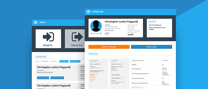
I worked with BoltAffect to understand the client needs and potential pain points. Using this we created wireframes to prototype the user flow and identify potential problems before moving into the visual design phase. For the visual design and prototyping, I created three primary screens needed for the check-in and camper management process, the Admin Dashboard, Camper Details, and Account Information screens. Using the available Camp Infinity assets and the wireframes, I created a design system to keep content and interface elements consistent across the dashboard app. 
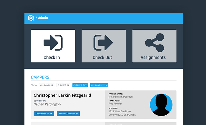
The initial project goal was to reduce counselor errors by developing three primary screens for the camp counselors to check in campers, find important information about each camper’s needs, and view account information related to each camper. The first screen developed was the Admin Dashboard. This screen needed to clearly indicate what action was being taken, whether checking in, out, or viewing camper assignments and needed a filterable list of campers along with important information about the parent or guardian, transportation method, and home address. Although the camper table filters could be adjusted on the fly, we included large mode buttons at the top that would automatically apply specific filter sets for checking in, checking out, and counselor assignments. 
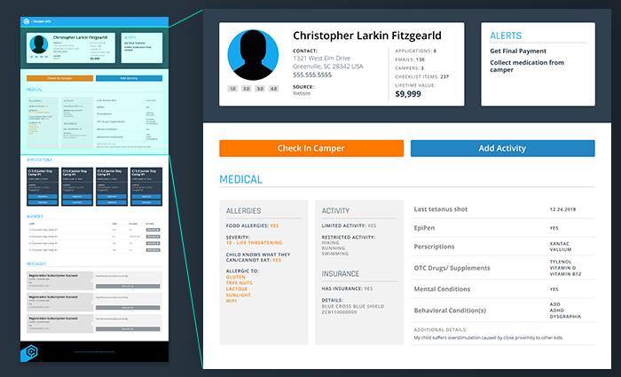
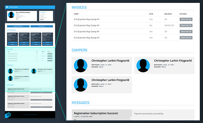
The Camper Details and Account Details screens both had a similar base with overlapping content but different functions. To check a camper in, the greeting counselor would visit the Camper Details screen and review the camper information. This screen also provides detailed information about each camper’s needs, particularly important medical information, to the assigned counselor. The Camper Details also gives counselors access to camper message history, applications attached to the camper, and any invoices. This information was duplicated for the Account Details screen that is accessible to both the account owner and the camp personnel. In place of the camper medical information, cards for each camper connected to the account were included.
Results
After implementation of the new dashboard, Camp Infinity reported the first year that they had zero check-in errors.
