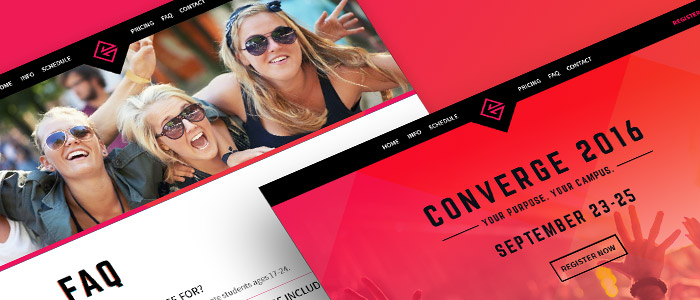
Converge is an annual conference in Kentucky for young adults. I worked with stakeholders to create a bold website announcing Converge that provides essential information about the conference and enables visitors to register to attend.
Process
The discovery phase identified that my client needed the site to raise awareness for the Converge Conference with young adults and provide a way for them to register to attend the conference. We also determined that the site needed to provide answers to frequent questions and a means to contact the conference team.
Using this as a guide, I worked with Converge to develop a sitemap and content strategy to achieve the site goals. We determined that Converge needed a small brochure site consisting of the homepage, FAQ, and contact page with registration handled through an external provider. To promote the conference, we included a video teaser and wrote copy to build excitement and provide information about conference speakers, location, schedule, and pricing. 
The design language for the site was heavily based on the Converge logo and brand colors with the diamond shape of the logo inspiring design patterns found in section header images and the layout of the site. The brand colors were integrated extensively in the site design giving the site a fresh, vibrant look. These mockups were then handed off to the development team for implementation.
Result
The site successfully met the client goals and was well received by the client and the conference audience. It continues to provide Converge with an easy to maintain, responsive website that visually differentiates the conference from competitors. 
